vaishnavi subramanyam

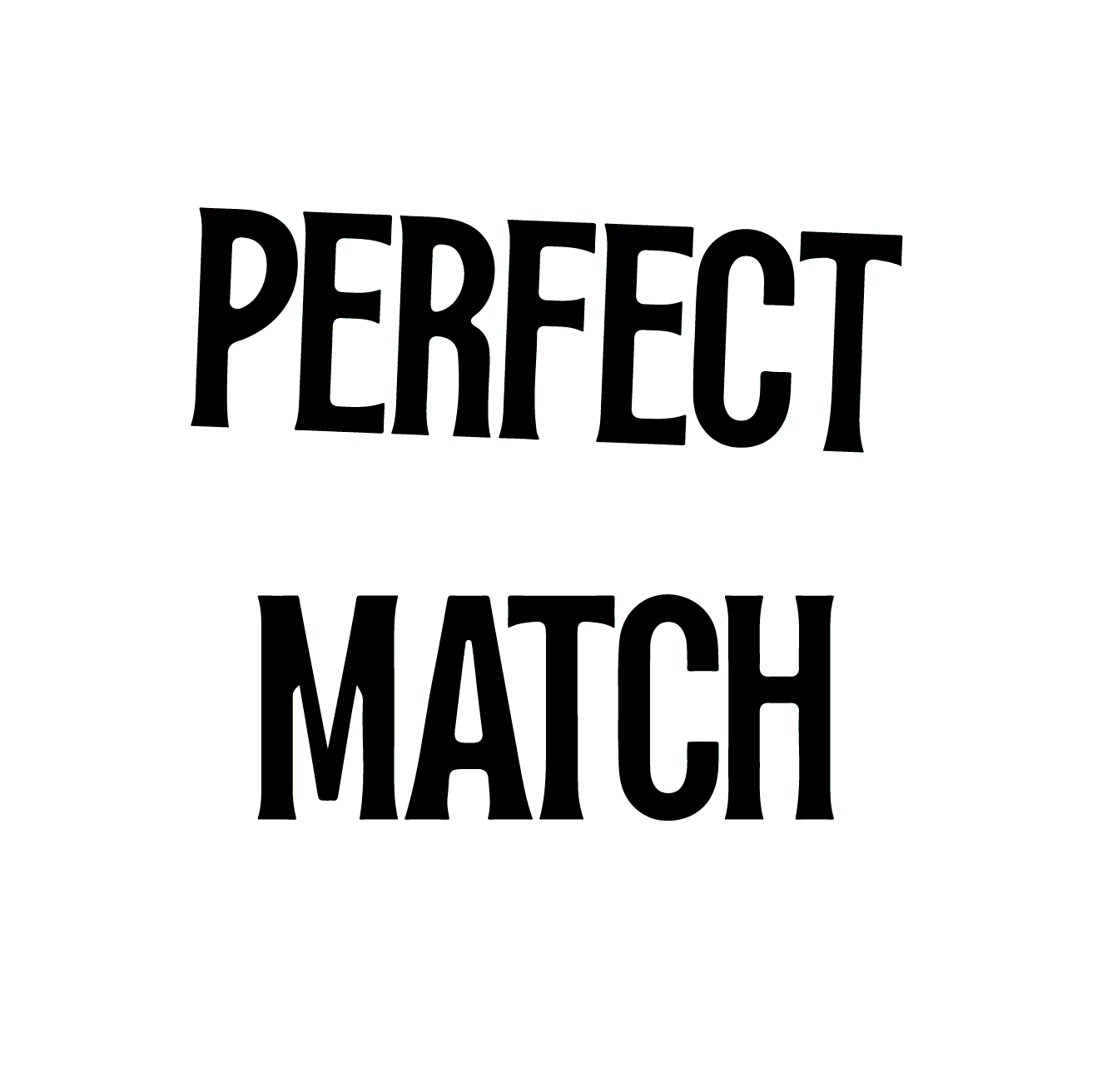
The Perfect Match
Card Game Design (Typography + Packaging)
MyMuse India 2024
As MyMuse expanded into couple’s games, we set out to design one that was lighthearted, PG-13, and inclusive, something that could bring out playful competition while celebrating intimacy in its own way.
The result was The Perfect Match, a game built to spark laughter, conversation, and a little rivalry, whether between newlyweds or long-time partners.
I led the art direction, packaging design, gameplay mechanics, prompt writing, and campaign assets. From the look and feel of the cards to the ads and web creatives, my role was to create an experience that feels approachable, fun, and true to MyMuse’s mission of making intimacy accessible, acceptable, and amusing.

Typography + Packaging
The Perfect Match is a card game designed for Indian weddings,
a playful way to quiz couples and entertain guests. The packaging needed to be both gift-worthy and easy to understand at a glance, especially for online shoppers.
Typography played a key role in setting the tone: Tan Jambore brought in a retro-modern charm, Figtree ensured legibility for body text, and True North added a sketchy, casual touch to keep things fun and light.
Visually, the design blended nostalgic Indian cues like matchbox art with a fresh, contemporary layout. Bright colours, bold type, and playful icons made the game feel festive and intuitive.
Whether placed on a wedding stage or tucked into a gift hamper, The Perfect Match was made to spark smiles and good vibes.


Unboxing Experience
Unlike any other card game that the brand had done earlier,
‘The Perfect Match’ had multiple components to the game play which needed to be well compartmentalised and required careful consideration in layout and packaging.
Inside the box, each category of cards has its own dedicated section, making the experience feel organised. Separate slots hold the manual, two pens, and two writing boards, all neatly arranged to keep everything accessible and in place.
One of the key design challenges was determining the precise sizing of the cards and boards to ensure everything fit seamlessly within a compact form, striking a balance between usability, and cost-efficiency.
Quirky copy on each side of the packaging got the user to truly engage and experience the product adding to the unboxing experience.


Personal Note
As a designer, I believe we leave a piece of ourselves in every project we work on. The Perfect Match will be one of my most cherished projects not just for its creativity but because I had the chance to involve my parents in it.
This ‘Bring Your Parents to Work’ Day redefined my relationship with my colleagues, who went the extra mile to make my parents feel comfortable, at ease on the shoot and most importantly, just have fun!
Watching my parents match their answers in the game and effortlessly make each other laugh helped me see love through
a new lens; both for them and between them.
It was easily one of my favourite days at work.
Catch a glimpse of all the fun we had below. ↓

