vaishnavi subramanyam

Flick
Product Identity (Typography + Packaging)
Art Direction | Creative Strategy
Being the first-of-its-kind product in the market, educating customers about the use case of the massager was a crucial part of the design direction. The product, a tongue massager, was named Flick, to capture the playful yet precise action of flicking.
The typographic lockup needed to convey this idea subtly.
As both a designer and writer, I often begin by exploring words. This could be synonyms, adjectives, or phrases that can spark visual associations. Alongside mood-boarding, this becomes my first step in the process. It not only helps me generate concepts but also enables non-designers to connect visuals with words more intuitively. From there, the art direction and packaging design can be anchored into the flow. Navigate to see the process↘︎


Type Lockup
While exploring different fonts and visual styles, one thing became clear: the identity needed to somehow reference the idea of a tongue. This was a metaphor for intimacy and play.
In the explorations, it was important to strike a delicate balance between playfulness and maturity. Too much playfulness risked making the design feel juvenile, while leaning too far into maturity could strip away the charm.
To create the lockup, I began by tweaking existing fonts and eventually settled on Ashington, a vintage retro typeface inspired by 70s and 80s lettering, known for its bold character and expressive style. Tap the video below to see the process.
It involved experimenting with specific alphabets in the word, extending their forms to resemble a tongue, almost like a slurp. Slide 4 on the above deck shows the explorations.


Packaging + Manual
By this stage, the packaging system at MyMuse had been standardized. The external sleeve followed the brand’s discreet inkpen blue, while the inner tray carried the signature doodled treatment. But, we would always slip in cheeky copy across different sides of the box, ensuring that customers fully engaged with the unboxing and experienced the product with a sense of play.
The manual, however, always left room for playful exploration. It became a space to go beyond instructions, using lighthearted illustrations of the product to communicate care tips in a fun and engaging way. This balance of consistency and creativity kept the unboxing experience both familiar and fresh. Scroll on, to take a peek ☺

.png)

Art Direction
The mood board from the initial deck set the foundation for the art direction. The team experimented with props that subtly echoed feminine forms, adding a layer of visual metaphor without being too explicit. Suggestive enough to spark curiosity, yet tasteful enough to remain sophisticated.
To complement this, the image treatment chosen was intentionally soft and atmospheric. A hazy, nostalgic, dreamy, and dewy aesthetic gave the visuals almost a surreal quality. The intent was to portray an elevated experience that felt intimate, sensual, and aspirational all at once.


Creative Strategy
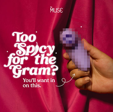
With every product launch, we had the opportunity to experiment with new concepts in ads. For Flick, I came up with the copy and visual concepts that felt cheeky, honest and most importantly relatable. It had to be clickbait-y and Meta safe.
A few of these ads ended up performing exceptionally well. The first one from the set below hit a 4.86 ROAS, the highest we’d seen on a static ad. Honestly, it started as a brain fart of ideas I wanted to try, but sometimes those unfiltered, instinctive directions turn out to be the most effective.


✄ ┈┈┈┈┈


That's all folks! ✌︎
┈┈┈┈┈ ✄